Hey everyone! Ever wonder why you’re drawn to a specific vinyl color for a decal, or why certain resin coasters just feel expensive while others feel fun and bright?
It’s not just a coincidence; it’s actually the psychology of color. As makers, we spend so much time picking out the perfect DTF sheets, resin pigments, or hoodie colors, but did you know we’re actually talking to our customers through those colors before they even read our signs?
I’ve been reading Cath Caldwell’s book, Graphic Design for Everyone, and it’s a total game-changer for our shops. Let’s break down how we can use these color secrets to help our booths and products stand out.
Color is a “Vibe”
In her book, Caldwell explains that color is the very first thing our brains notice. Before we see the shape of a tumbler or read the name on a hoodie, we feel an emotion. For us makers, this is like a superpower.
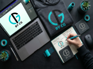
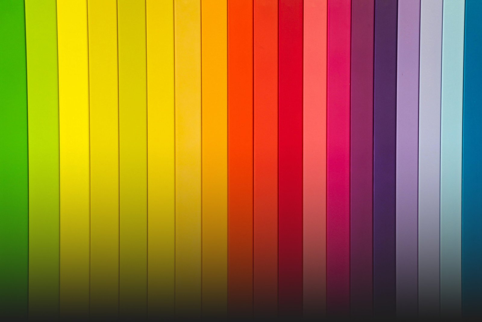
Turquoise and Teal: These are the trust colors. They feel fresh, calm, and professional. If you use these for your branding or your sublimation blanks, they tell people, I’m a pro, and I care about the details.
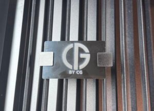
Deep Black and Slate: These scream high-end. If you’re doing laser-engraved wood or slate coasters, black creates a high-contrast, premium look that makes people feel okay about paying a little more for quality.
Corals and Warm Oranges: These are action colors. They grab the eye and create excitement. These are perfect for your Mother’s Day signage or New Arrival stickers to get people to stop in.
Making Colors Work Together
One of the best tips in the book is about Color Harmony. You don’t want your craft fair booth to look like a disorganized mess; you want it to feel intentional.
The Same-Family Look (Monochromatic): Use different shades of one color like a light turquoise shirt with a dark teal DTF print. It looks super clean and high fashion right now.
The Opposites Attract Look (Complementary): Use colors from opposite sides of the wheel, like an orange logo on a blue hoodie. This makes the design STAND OUT! It’s great for a poster where you want the Mother’s Day text to be readable from across the room.
Tips for Our Next Event
Based on what I’ve learned, here are simple ways we can use color to sell more:
• Think About Your Hero Color What’s the main color of your brand? If you love turquoise and black, use that everywhere: your business cards, your tablecloths, and your social media posts. It helps people recognize your work instantly.
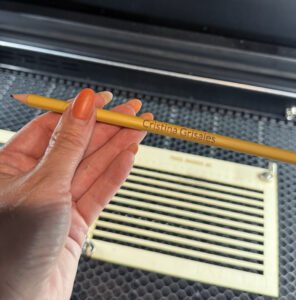
• Contrast is Your Best Friend In the world of sublimation and vinyl, contrast is everything. If you have a dark hoodie, use a bright white or silver design. If your resin has light, gold-leaf flakes, put it on a dark display stand. If the colors are too similar, your hard work will just disappear!
Why This Matters for Us
At the end of the day, we make things because we love the process, but if we want to grow our businesses, we have to think like designers. As Caldwell says, design is for everyone. You don’t need a fancy degree to make something look great; you just need to understand how colors work together.
Next time you’re loading a shirt onto the heat press or mixing a fresh batch of resin, ask yourself: What do I want people to feel when they see this? Happy crafting, everyone! Let’s make something beautiful.