If you’ve ever spent time in a professional design setting, especially in a fast-paced environment like a Public Relations office, you know the classic tug-of-war. A client comes to you with a project, their eyes light up, and they utter those famous three words: “Make it pop!”
As a designer, you know exactly what they mean. They want energy, they want hierarchy, and they want the audience to be wowed, but then, they hand over the content. Instead of a punchy headline and a few bullet points, you’re given three pages of single-spaced text that absolutely must fit on a single 5×7 postcard or a flyer. This is the ultimate challenge of Hierarchy in Layout. When everything is “important,” nothing is.
Fighting for Room to Breathe
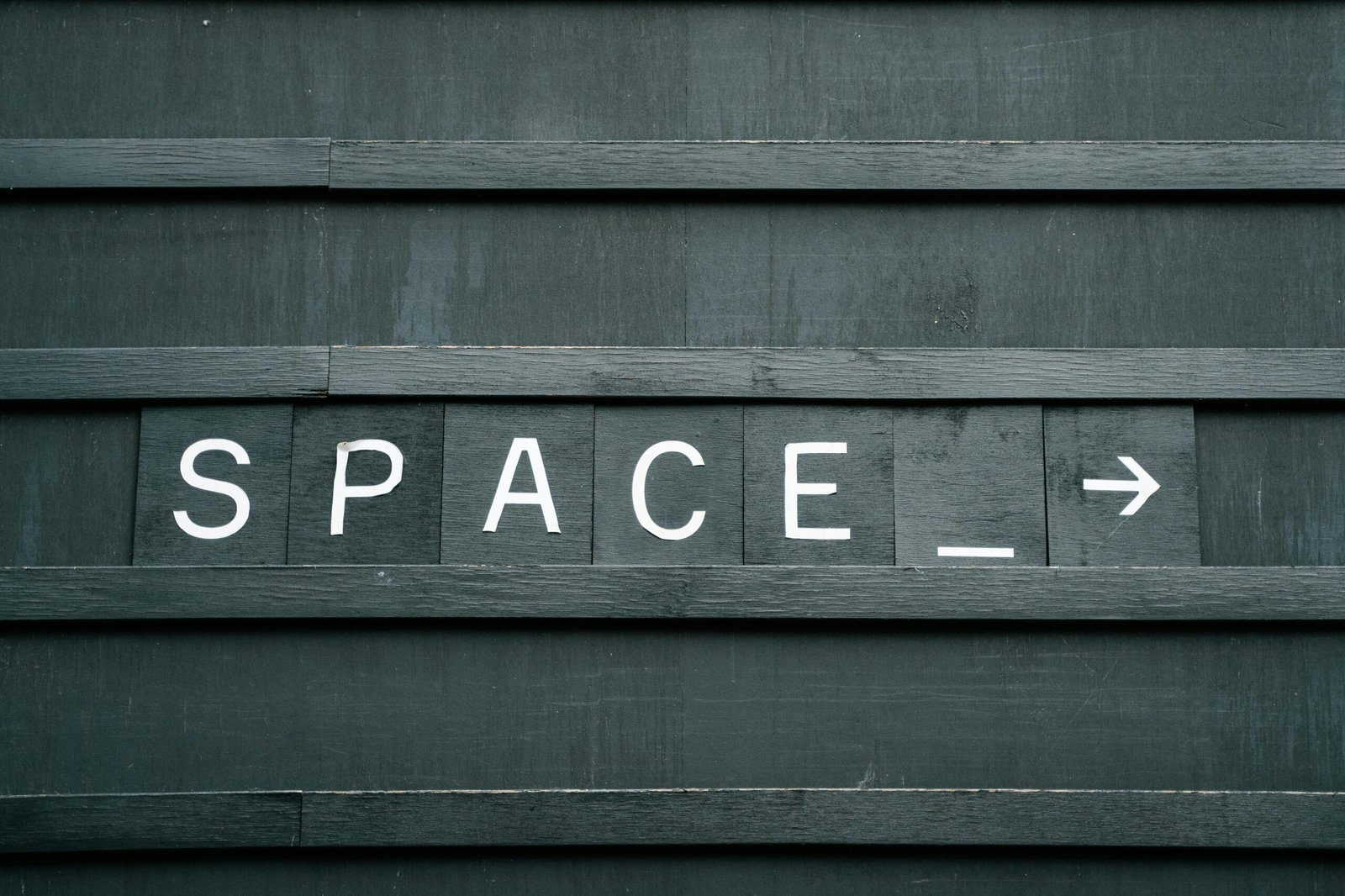
In Graphic Design for Everyone, pages 127-155 emphasize that white space is a designer’s best friend. It’s the silent part of the hierarchy that tells the eye where to rest and where to focus. However, when a client provides enough copy to fill an encyclopedia, white space is often the first thing to disappear.
In a PR office, your job is to communicate a message clearly. When a layout is crammed with text from edge to edge, the “pop” the client wants is physically impossible to achieve. The design becomes gray, a solid wall of text that looks more like a legal contract than a vibrant advertisement.
How to Negotiate Hierarchy
When you’re faced with a heavy copy situation, the principles from our reading become your best defense. Here is how to handle the “Make it Pop” request when the space is tight:
Establish a Level One at all costs: Even if the text is dense, you must fight for one big, bold entry point. Whether it’s a striking headline in Myriad Pro Black or a high contrast image, something needs to be significantly larger than everything else. This creates a hook that earns you the right to show the viewer the rest of the text.
Chunk the Information: If you can’t delete the copy, organize it. Use subheads, boxes, or tinted backgrounds to break the wall of text into bite-sized pieces. This mimics the feeling of white space by giving the eye clear stopping points.
The Power of Contrast: When you can’t use size (because you’re out of room), use weight and color. A bold turquoise subhead against black body copy creates hierarchy without taking up extra millimeters of space.
Advocate for the Audience: Sometimes the best design move is a conversation. Remind the client that a design that “pops” is a design that people actually read. By trimming 10% of the text, you can increase the impact of the remaining 90%.
In Short
Working in design is often about being a visual translator. You have to translate a client’s desire for excitement into a functional layout, even when the constraints are tight. By mastering the levels of importance and protecting whatever small pockets of white space you can, you ensure that the message doesn’t just exist on the page, but actually reaches the person looking at it.
Remember, design is like a suitcase; if you pack too much, it won’t close. But if you fold everything neatly and prioritize the essentials, you’d be surprised how much you can fit while still looking sharp.