Reading and Writing

Book: Animated Storytelling
Simple Steps for Creating Animation & Motion Graphics by Liz Blazer (Second Edition)
Chapter 9: Technique This chapter focuses on the Technique phase, where you finally choose how to bring your art to life. The main lesson is that your technical choice, whether it’s 2D, 3D, or stop-motion, should always support your story’s message rather than just being a random style choice. Liz Blazer encourages animators to experiment with different methods to find a unique voice and to perform small tests to see how things move before starting the final production. Ultimately, the chapter serves as a bridge between your planning and the actual acting of your characters, ensuring that your style and story work perfectly together.
Research to Inform
Squash and Stretch
In the Amazon logo animation, the letters stretch upward as they move into place to create a sense of speed and energy, while the shipping box squashes down when it lands to give it a heavy, feel.
Anticipation
Before the N breaks apart into the colorful vertical ribbons, it zooms slightly toward the viewer. This small movement builds a tiny bit of tension that makes the transition into the barcode lines feel more powerful and satisfying.
Staging
In this video staging makes the story easy to follow by removing distractions and guiding our eyes to the action. The dark background makes sure you focus only on the lamps and the ball. By using camera angles and poses, like the small lamp hanging its head in sadness, Pixar communicates feelings without any words. Also, only one thing happens at a time, making the parent and child relationship between the lamps clear.
Follow Through and Overlapping Action
The movement feels smooth and natural. Instead of everything moving at once, the different parts of the logo slide in at different times, creating a layered effect. When the letters finally stop, they don’t just hit a wall; they have a tiny bounce that makes them feel like they have real weight and momentum. This extra detail makes the animation look much more professional and keeps it from feeling stiff or robotic.
Slow In and Slow Out
In this animation, Slow In and Slow Out is used to make the handwriting look graceful and high-end. Instead of the lines appearing at one stiff speed, they start slowly, move faster through the middle of the letters, and then gently slow down as they finish. The speeding up and slowing down mimics a real person writing with a pen.
My Creative Process
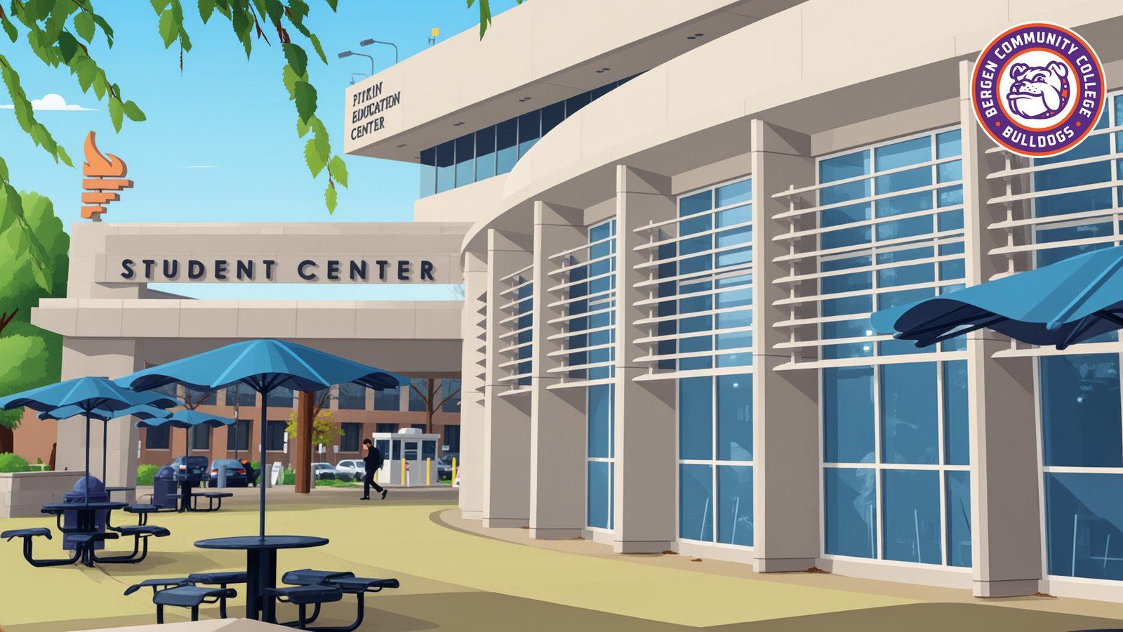
I used the squash and stretch principle to make the Bergen Community College logo feel more like a real, physical object instead of a flat image. When the logo pieces move quickly into the frame, I stretched them out to show speed and energy. As they reached their final spot, I added a slight squash effect to simulate the impact of them landing. By keeping the overall volume of the shapes consistent during these movements, I was able to make the animation look smooth and natural rather than stiff. The logo then quickly snaps back to its normal shape, giving the animation a professional and polished finish.