Reading and Writing

Book: Animated Storytelling
Simple Steps for Creating Animation & Motion Graphics by Liz Blazer (Second Edition)
Chapter 10: Animate
Choosing the right technique is like picking the best tools for a job. Whether you use 2D drawings, 3D models, or Stop-Motion, your choice should always help tell your story better. Liz Blazer says you should experiment with different styles to find what works for you. She also suggests doing quick tests of how things move before you start the big project. This helps you make sure the characters feel real and that the art style matches the mood of your story perfectly.
Once you pick a style, you focus on how the characters act. You use special tricks like Squash and Stretch to make movements look bouncy or Anticipation to show a character is about to jump. These small details are important because they show how a character feels without using any words. By testing these movements early, you can fix problems and make sure your final animation looks smooth and professional.
Research to Inform
This animation does a great job because the food items and colors change smoothly, making the app feel alive and responsive. The animations also guide your eyes naturally, showing you exactly where to look as you move from the start screen to the menu. I tried using a similar masking technique to switch between the main screen and the student portal.
https://www.youtube.com/shorts/YGk4H5v29PY
This animation uses a scrolling effect to create a sense of 3D depth, making the product feel immersive and high end. The smooth transitions and floating elements guide the viewer’s eye naturally, transforming a simple website layout into a dynamic and engaging experience.
This animation uses anticipation to make transitions feel powerful. Before the screen changes, the main text zooms in slightly toward the viewer. This small movement builds a tiny bit of tension, making the switch to the next section feel more satisfying and impactful. It keeps the viewer engaged by giving them a hint that something is about to happen.
This animated gradient button uses staging to make the action clear and easy to follow. The dark, simple background removes all distractions, so your eyes stay focused on the glowing purple border of the Animate button. The way the light moves around the edge guides your attention directly to the button, making it obvious that this is the main part of the screen to interact with.
Instead of everything moving at once, different parts of the UI slide in at different times, which creates a professional look. When the buttons stop moving, they have a tiny bounce that makes them feel like they have real weight, preventing the animation from feeling stiff or robotic.
My Creative Process
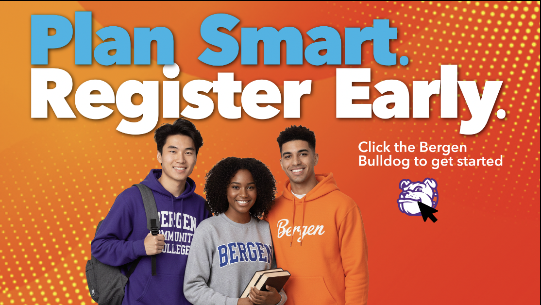
I combined two goals by creating a work-related demo for student registration that can also be used on social media. To make it visually appealing, I animated the title, background, and a custom button featuring the school mascot’s head. When clicked, the mascot’s full body pops up, and a masking technique transitions smoothly to the student portal, making the interface feel alive and responsive.
Here’s a link to my UI animation demo.